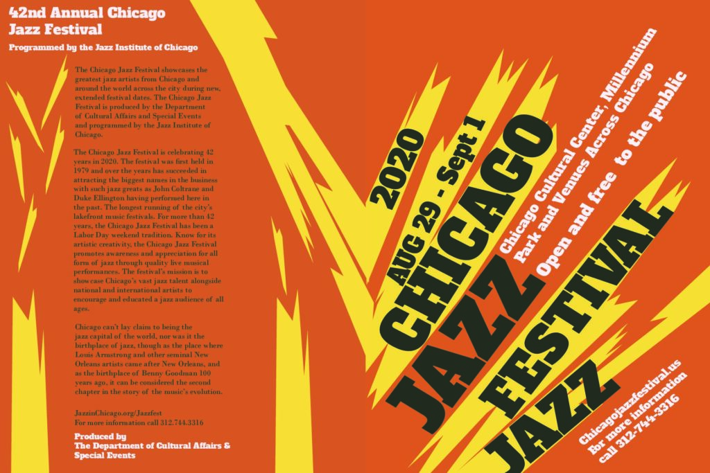
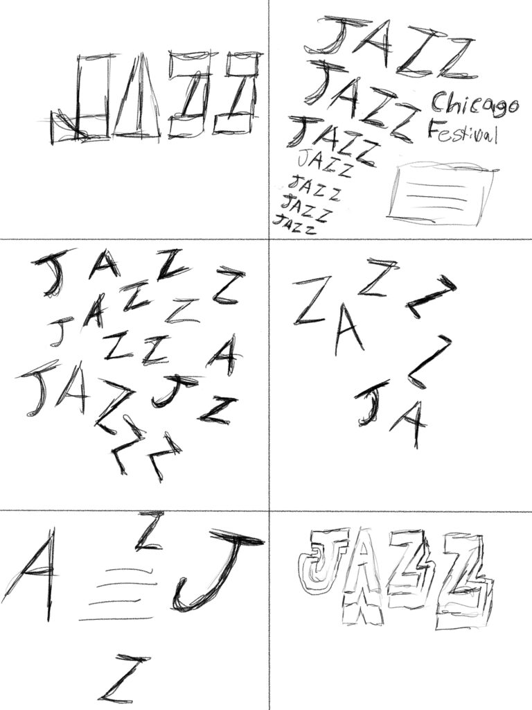
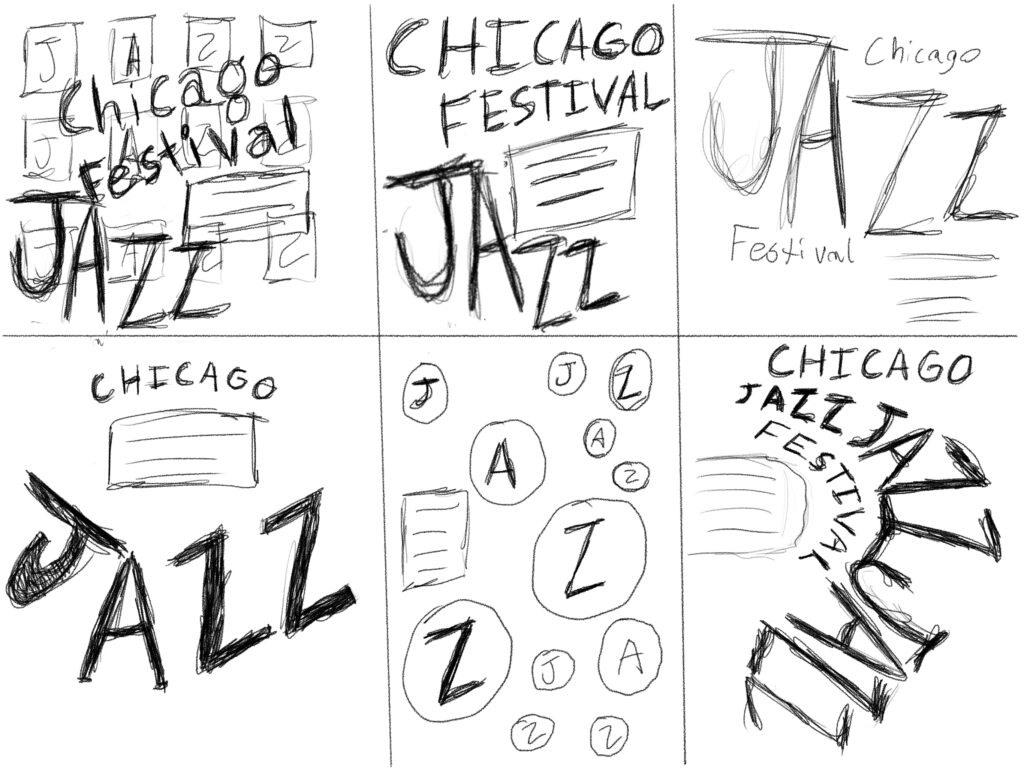
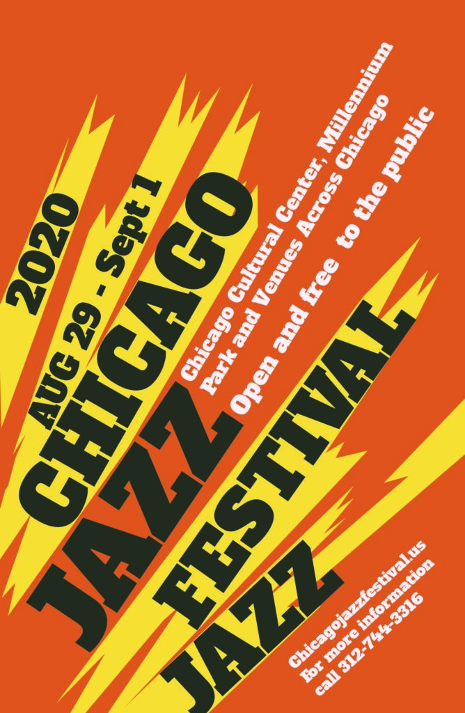
The whole point of this project was to create a jazz poster and Brochure for The Chicago Jazz Festival. I had to think about the power of music and implement that into my design. The process started with trying to identify words to the concept of jazz music. I was looking for colorful and bright. I also wanted to focus on bursting the colors of the page. Once I had my descriptive words, I began work on sketches that aligned with the concept of bursting with these rightful color concepts that would be seen coming off of the page.
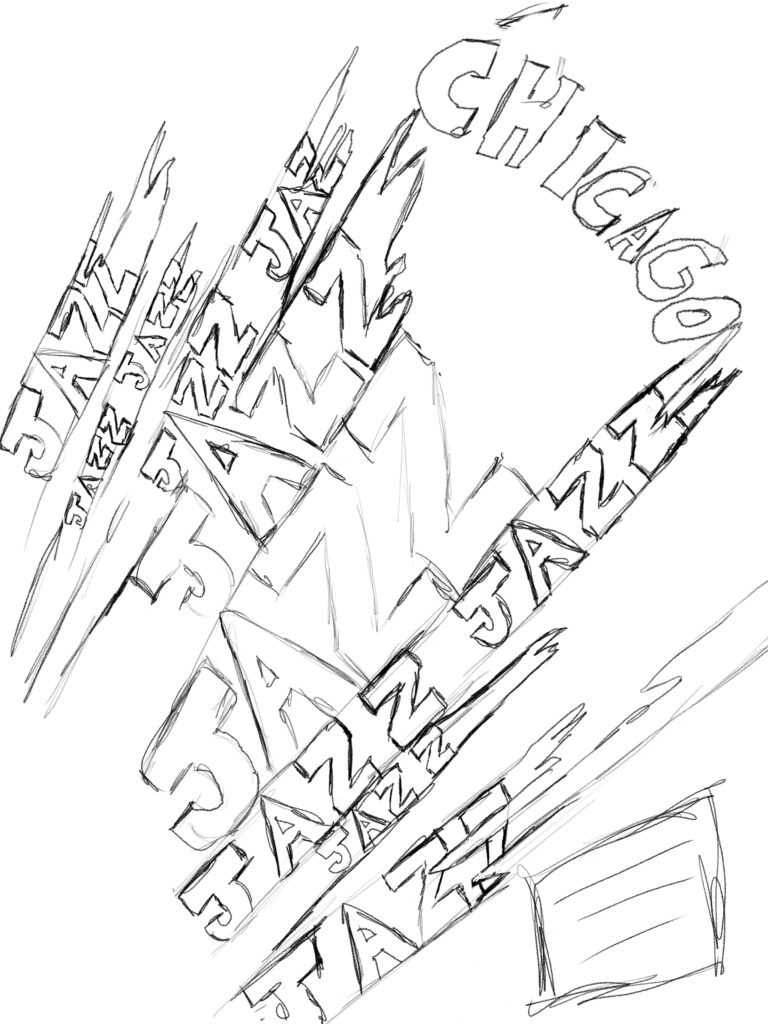
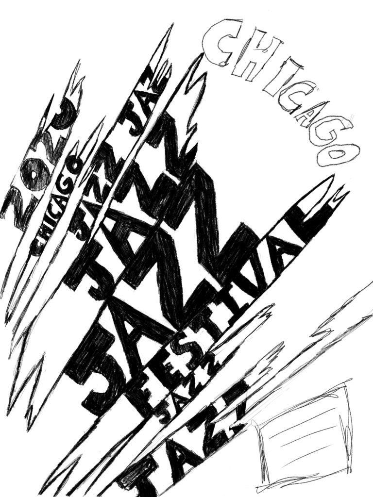
Process Sketches
Below are some process sketches of the concept of ‘bursting.’ I wanted to highlight the effect that Jazz music had on the culture and wanted to pick a more outbursting effect on the poster.
Color
Next choice was color. I wanted to be playful with my color choices and see which color combinations would work best with this concept. In the end I choose red and yellow, but it was fun to experiment with color theory. I decided on the orange and yellow because I felt like those colors would make that concept of bursting from the page more vibrant.
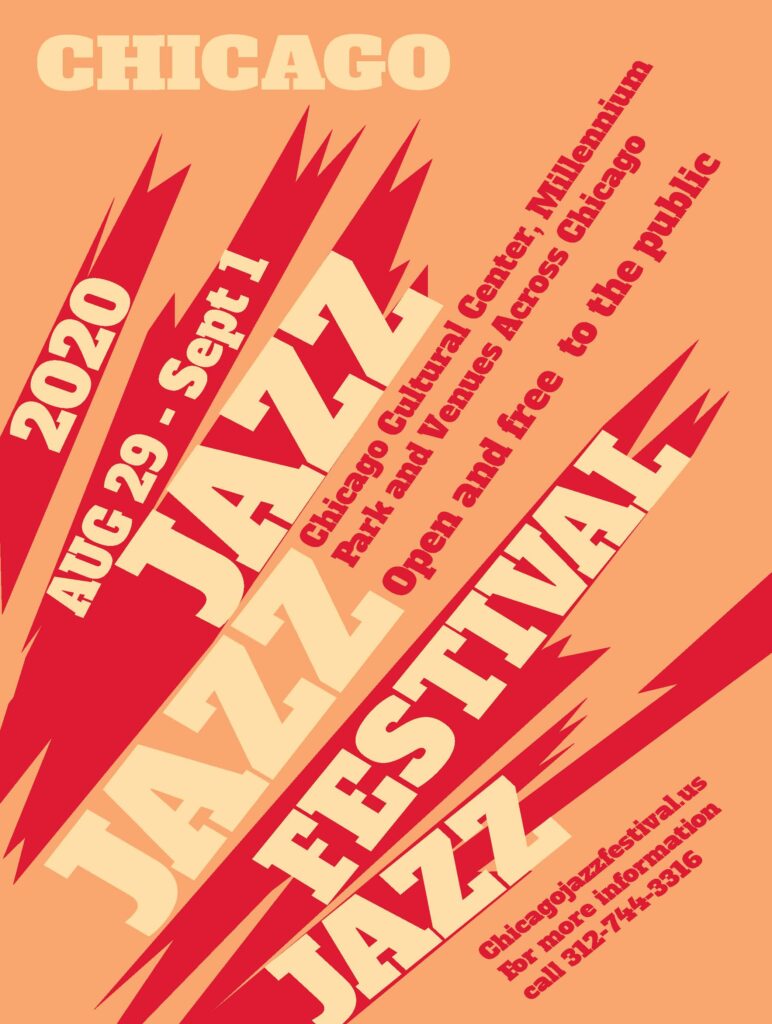
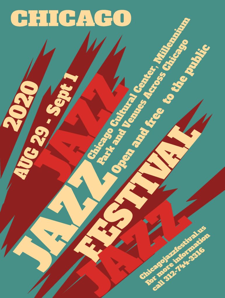
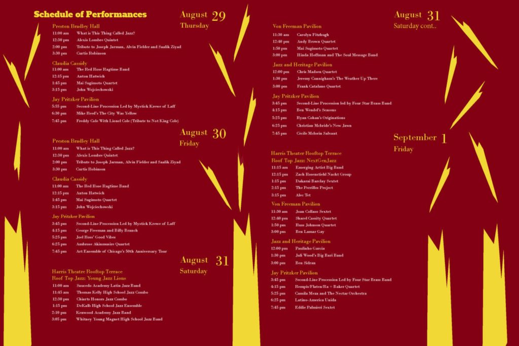
Jazz Brochure